
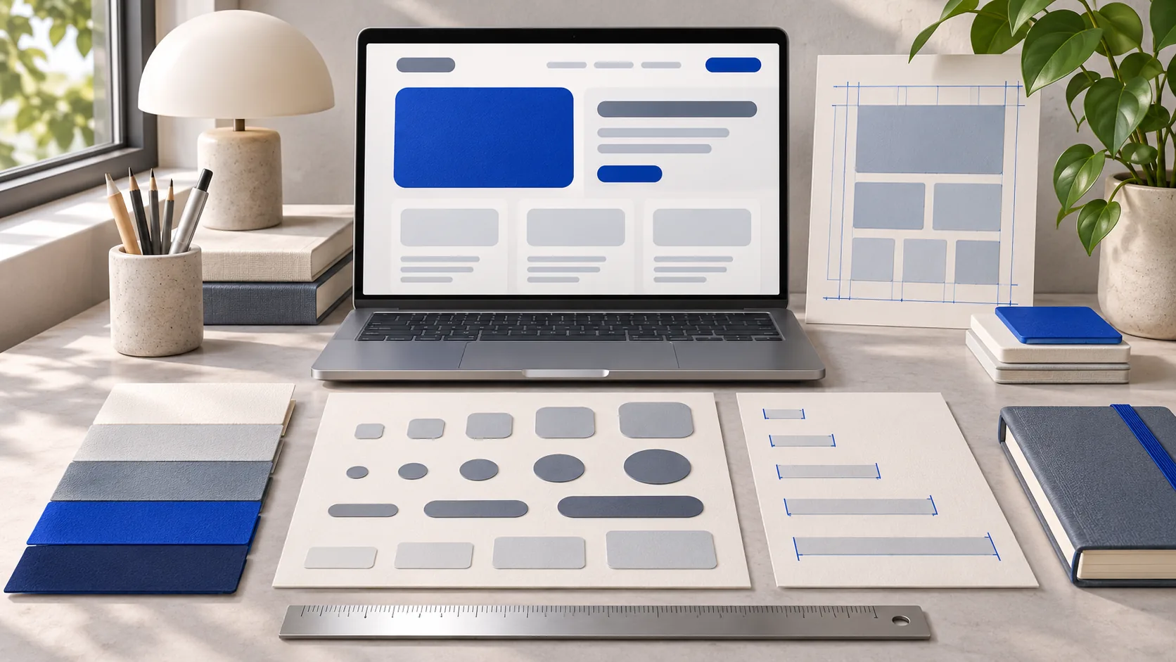
Treat the file as a specification
The Awesome DESIGN.md collection provides examples of written visual systems. Use it to study the kinds of decisions a specification can record. Create an original system for your project, and explicitly ask your agent to read the file; do not assume every assistant discovers a filename automatically.
You do not need another company’s logo, exact layout or visual identity to make a consistent site. Choose a small set of type, spacing, surface and control rules that suit your content. Existing project styles should be the starting point when you are extending a site.
An original starter specification
This example is written for a quiet tool interface. Adapt the values to your own project rather than combining several conflicting systems.
# DESIGN.md

## Reading and layout
- Light surfaces, dark slate text, one cobalt action color.
- Maximum content width: 1180px. Article text: about 780px.
- Use a small spacing scale: 4, 8, 12, 16, 24, 32 and 48px.
- Stack two-column forms on narrow screens.

## Controls
- Visible labels; do not use placeholders as labels.
- Keyboard focus must be visible.
- Primary actions have a solid accent fill.
- Secondary actions have a neutral border.
- Disable actions whose required result does not exist yet.

## States
- Errors explain what the user can change.
- Clear stale calculated results after an invalid edit.
- Include loading, empty and success states when relevant.

## Verification
- Check the main journey with keyboard input.
- Check a narrow phone viewport and a desktop viewport.
- Confirm readable contrast and no page-wide horizontal overflow.
- Use real screenshots as evidence; generated art is illustrative.
Apply it to one complete page
- Save the specification in the repository and tell the agent which page it applies to.
- Ask it to reuse existing components and tokens before introducing new ones.
- Implement one complete interaction, including validation and an empty state.
- Inspect the browser at narrow and wide widths, then correct observed inconsistencies.
Try this prompt with the project brief you generated:
Read PROJECT_BRIEF.md and DESIGN.md.
Apply the design rules to the first complete user journey.
Reuse the existing styles where they already match.
Include focus, invalid-input and empty states.
Show the rendered result and report the checks you actually ran.
Review behavior as well as appearance
A screenshot may show consistent colors while hiding an unlabeled input or an unreachable action. Check keyboard order, long labels and errors. Try the smallest and largest realistic content values. Look for clipped text and tables that push the entire page sideways.
The specification should be specific enough to review. “Make it premium” is difficult to test; a visible focus ring, a bounded reading width and a consistent spacing scale are observable. If a component needs an exception, document why rather than silently drifting to another visual system.
Keep the document aligned with the code
When you accept a new component or token, update the specification and the shared styles together. Remove rules you no longer use. A long document full of abandoned alternatives makes future changes less predictable.
Use the browser testing exercise to check the journey after visual edits. Choose only the repositories you need from our vibe-coding toolkit; adding another UI package is not itself a design decision.